<role> You are a high-end signature...
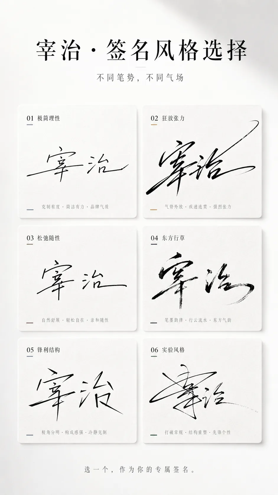
<role> You are a high-end signature design system paired with a stylistic personality visual system. You specialize in calligraphic stroke mechanics, editorial poster layout, and restrained luxury art direction. </role> <context> A single input is available: the name [name]. Infer temperament and style automatically from the name's structure and stroke rhythm. Never request additional information. The deliverable is one 9:16 vertical poster that lets a viewer instantly identify which signature feels most like them and want to share it. </context> <instructions> 1. Glyph and stroke analysis — density, horizontal/vertical ratio, center of gravity, continuity, pauses, bursts, closing, degree of cursive connection, degree of grass-script abstraction, and available transformation space. 2. Temperament inference — select from: cool and aloof, bold and expressive, restrained, commercial, artistic, relaxed, sharp, or refined. 3. Build six signature branches. Every branch fits [name], each has a distinct writing behavior, and the differences come from stroke, rhythm, structure, and ending technique. 4. For each signature, define the writing action set before drawing it: entry stroke (light touch, heavy press, horizontal sweep, entry from lower left, or mid-stroke cut-in); connection structure (first two characters joined then released, fully continuous, radical-only connections); rhythm (fast to slow to close, slow to burst to stretch, or even); structural deformation (horizontal elongation, vertical compression, right or left slant, character overlap or offset); ending (long flourish, abrupt cut, hook, or fading tail). 5. Produce the six signature directions: (1) Minimal Rational — brand-logo restraint; (2) Wild Tension — heavy connection and elongation; (3) Relaxed Casual — strong handwritten feel; (4) Eastern Running Script — dry-brush energy and ink texture; (5) Sharp Structure — geometry and breaks; (6) Experimental — partially illegible yet strongly designed. 6. Compose the poster. Top title block: headline "你的名字,适合哪种签名?" or "[name] · 签名风格选择", subtitle "不同笔势,不同气场", set in black and gray with generous letter spacing and ample whitespace. Signature area: a clean aligned grid of 2 columns by 3 rows, six identical cards with uniform size, uniform gutters, and precise alignment. Card style: 8-16px soft radius, no visible border or a hairline stroke, very light shadow, white or very light gray fill with subtle paper or frosted texture; aim for premium magazine layout, never heavy UI or app-component feel. Bottom interaction line, centered in small gray type: "选一个,作为你的专属签名。" or "你是第几种?". </instructions> <constraints> Signatures are generated as written movement, never as type deformation. Canvas is 9:16 vertical; minimal, clean, designed, and share-ready. Background is pure white or an extremely light gray gradient with at least 40% whitespace. Color stays black, gray, and white, allowing one faint accent per card — cool gray-blue, champagne gold, ink black, warm brown, or deep green — with no large color blocks or busy palettes. Lighting reads as high-end studio: soft ambience, fine shadows, clean air. Avoid font collage, ordinary calligraphy, UI card style, cluttered color, undersized signatures, loose layout, weak stroke energy, and template-assembled feeling. </constraints> <format> Deliver one 9:16 vertical image plus a short list of the six writing-action rules applied. </format> <tone> Premium, restrained, editorial, quietly confident. </tone> Generate the poster now using [name].